Why a Club Crest Needs to Work at Every Size
A club crest that works at every size stays recognizable on a stadium display, shirt badge, ticket, and printed program through clear shape and contrast.
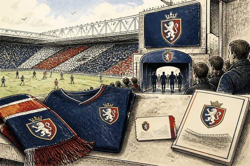
From the far side of a ground, a club crest may be a bright patch above the players’ tunnel. On a paper ticket, it may shrink to a mark no larger than a fingernail. A crest that works at every size keeps its identity in both places—not by carrying every detail through unchanged, but by making its most distinctive features easy to see.
That is the central design challenge: create one identity that can adjust to its setting without becoming a different badge. Silhouette, contrast, and the hierarchy of details do most of the work. They help a supporter recognize the club before they can read its name or inspect its symbols.
What does “working at every size” mean?
A crest is a compact visual system, not merely a drawing placed on a shirt. It may appear on a stadium screen, a kit, a scarf, a membership card, a website, or a small printed mark. Each setting changes how much detail people can see and how clearly colors reproduce.
At a large scale, the eye can pick out fine lines, small lettering, and secondary symbols. At a small scale, those elements may merge. A thin border can disappear; two close colors can blend; narrow lettering can turn into a dark strip. The overall shape may survive even when the inner detail does not.
So “working” does not mean that every version looks identical at every size. It means the same club remains recognizable, and that the design’s relationships—its outline, dominant colors, and defining emblem—stay coherent. Some applications call for a simplified version, provided it preserves those relationships rather than improvising a new identity.
Why does the silhouette matter first?
Silhouette is the outer shape a crest makes when its interior is treated as one solid field. It is often the quickest clue available when the badge is distant, partially obscured, or printed too small for its finer features to survive.
Look at the outline in a single color. Does it have a distinctive contour, or could it belong to almost any shield? A familiar shape can be useful, but a generic outline needs a memorable feature inside it to carry more of the recognition. That feature might be a purposeful notch, a distinctive arrangement of forms, or an emblem with an unmistakable profile.
The test is not whether the crest looks attractive as a black cutout. It is whether its shape remains identifiable without relying on small words or delicate internal lines. If the answer is no, consider what major form could be made clearer before adding decoration.
Silhouette also helps organize detail. An emblem close to the edge can make the whole badge feel crowded, while an overly generous border may squeeze the central symbol. The outline and interior need to feel designed together, not like separate parts competing for space.
How does contrast protect recognition?
Contrast separates one part of the crest from another. It can come from light against dark, one hue against another, or a clear gap between shapes. Without enough separation, neighboring elements visually collapse, especially in small print or at a distance.
Color alone is not always enough. Two different hues may have similar lightness, so their edges become hard to distinguish when the crest is reduced or reproduced in a limited palette. A dark outline, an unprinted gap, or a clearer division between fields can preserve the structure without changing the club’s colors.
Check the badge in grayscale, then at the intended small size. If the crest loses its central emblem in grayscale, ask whether the design depends too heavily on color to define its parts. If it becomes a tangle when reduced, look for crowded intersections, weak boundaries, and lines that are too fine to hold their shape.
Contrast is also about priority. The main emblem should not disappear beneath decorative borders, small flourishes, or lettering. A supporter looking briefly should encounter the most meaningful form first, then the surrounding elements that explain or enrich it.
Which details should survive when the crest shrinks?
Not every detail has equal value. A useful way to decide is to sort the crest’s contents into three groups:
- Identity-bearing features: the outline, principal emblem, and colors that make the crest distinctive.
- Supporting features: secondary symbols, dividers, and decorative marks that help balance or explain the design.
- Size-sensitive features: fine hatching, tiny lettering, narrow gaps, and other elements likely to close up at small scale.
This is not a rule that secondary features must be removed. It is a way to decide what deserves space and what needs a simplified treatment. If a small symbol carries strong meaning but loses its shape when reduced, a designer can redraw it with fewer internal marks rather than discard it automatically.
Lettering needs particular care. A club name or founding detail may be legible on a large display but unreadable on a small badge. Enlarging the lettering can help only if it does not crowd the central emblem or distort the crest. In some uses, the crest can stand alone while the full name appears nearby as separate text. That preserves the badge’s structure without asking tiny type to do a job it cannot manage.
It is usually not worth adding micro-details simply because a large digital version has room for them. Fine texture can enrich a presentation, but if it vanishes in common applications or makes the core mark harder to read, it is decoration without a dependable role.
How can one crest adapt without losing its identity?
A club can treat its crest as a family of related versions. A full version may carry the complete name and secondary symbols. A compact version may use the same outline, core emblem, and color relationships while omitting details that would close up. A one-color version can preserve the silhouette and internal divisions where color printing is unavailable.
These versions should share clear rules. Specify which parts may be removed, which shapes must remain, and how the crest should sit against light or dark backgrounds. A version that quietly changes the emblem, stretches the outline, or swaps the dominant colors can weaken recognition even if it looks tidy in isolation.
Make decisions for real settings, not an imagined perfect display. Consider a shirt woven or stitched into fabric, a paper ticket printed in one ink, a narrow scarf panel, and a large screen viewed from across a ground. The material and reproduction method affect edges and color, so the design needs enough clarity to tolerate ordinary variation.
Say a club’s badge contains a shield, a bird, a motto, and a thin decorative border. Imagine the club is preparing a small mark for a membership card. The designer keeps the shield, redraws the bird with a clearer outer shape, and removes the border and motto at that size. The expected result is a compact mark whose defining silhouette and emblem remain visible, while the complete version still carries the supporting details on a larger display.
For production decisions, follow the relevant printer, kit maker, or display supplier’s specifications. The crest’s artwork may be sound, yet a particular process can call for adjustments to line thickness, color, or file preparation.
What should you inspect before approving a crest?
Review the mark in the places supporters will encounter it. A screen preview at large size can hide weaknesses that appear in print or on fabric. Ask for proofs or mockups where possible, and check the crest at its intended scale rather than judging only an enlarged design file.
- Check the solid silhouette. Temporarily fill the crest with one color. Decide whether its outline or principal form is distinctive enough to recognize.
- Check the smallest planned use. Reduce the crest to the size used on a card, label, or printed item. Decide whether the main emblem and boundaries still read clearly.
- Check the light-dark structure. View it in grayscale. Decide whether the key parts remain separate without relying entirely on hue.
- Check the edge and interior spacing. Look for lines, lettering, and gaps that nearly touch. Decide which details need more room or a simpler drawing.
- Check each color version. Compare the full-color mark with any one-color or reversed version. Decide whether each still feels like the same crest.
- Check it against its background. Place it on the actual shirt, paper, or screen color. Decide whether a border, backing shape, or alternate approved version is needed.
- Check the rules for use. Confirm which version belongs in each setting and whether stretching, recoloring, or adding effects is prohibited.
A proof should be judged both quickly and deliberately. First glance at it as a supporter might, then take time to inspect the details. The quick glance checks recognition; close inspection catches spacing and reproduction problems. Neither replaces the other.
Which club crest questions come up most often?
Should a club use one crest file at every size?
One master design can anchor the identity, but a single unchanged file may not reproduce well everywhere. A small-scale version can simplify fragile details while keeping the same outline, emblem, and color relationships.
Does a crest need readable lettering to be recognizable?
No. Lettering can identify the club when there is enough room, but it should not be the only feature that distinguishes the badge. A clear silhouette and principal emblem give the mark another route to recognition.
Should a club simplify its crest for embroidery?
It may need an embroidery-ready version because stitching handles fine lines and tight spaces differently from a large screen image. Keep the identity-bearing shapes and adjust detail to the kit maker’s specifications.
Can a one-color crest still feel like the club’s own?
Yes, if the silhouette and internal structure remain recognizable without the usual palette. Test the one-color version beside the full crest and preserve the same visual priorities.
What makes the design feel like the same club?
Consistency comes from keeping a few defining relationships intact, not from forcing every line into every application. The outline should still belong to the same badge, the principal emblem should keep its character, and the colors should retain their familiar roles when the medium allows them.
When reviewing a club crest at every size, start with what people notice at a glance. Protect the silhouette, give the main forms enough contrast, and let fine detail step back when the format cannot support it. That approach leaves room for a rich large display and a clear small mark—two useful expressions of one club identity.
Before approving a redesign, keep the smallest real application in view beside the largest. If the crest reads in both without sacrificing its defining shape, the design has a sound basis for the many places supporters will meet it.